OXIDE COMPUTER COMPANY
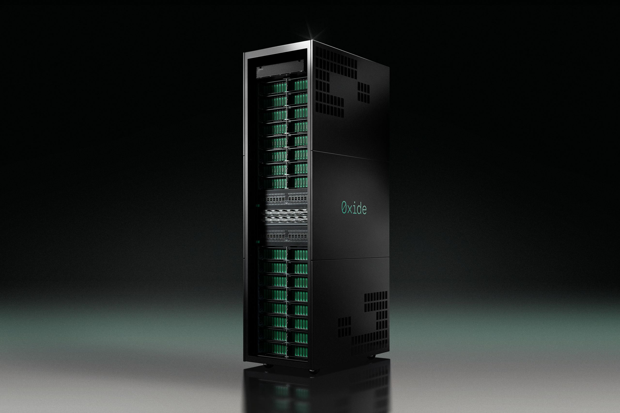
In a market dominated by cloud giants, Oxide's customers own their infrastructure outright: the rack, the hardware, the full stack. The goal was to develop an imagery language that could connect retro computing nostalgia and modern precision.
Role
Art Direction
Imagery Guidelines
Imagery Retouch
Imagery Edit
CGI Direction
Film Pre-Production
Team
Designers: Ben Leonard and Leo Luca
Marketing: Alizeh Iqbal
Timeline
Ongoing contract spanning through 2025 - Present
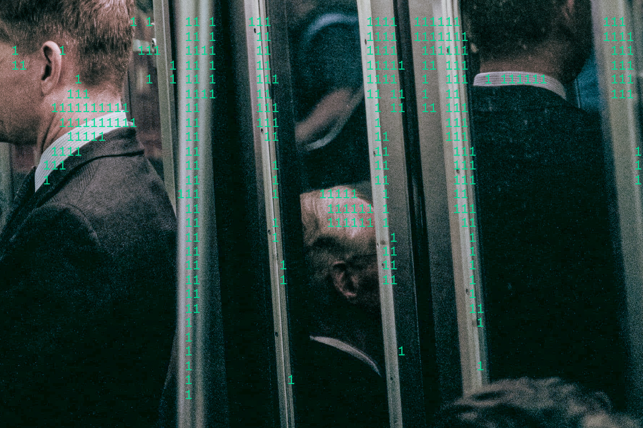
Oxide had a physical product, but its imagery wasn’t quite making that clear. Before I joined, the rack hadn’t been shown in its physicality, in a considered, designed context.
The challenge was to give the rack a tangible presence that communicated the care that went into getting it there. Alongside this, I was tasked with the wider question of defining how photography and CGI should sit within Oxide’s existing identity.
Goals
Establish imagery pillars to guide images within existing brand guidelines.
Define a flexible yet definitive guide to colour grading and CGI.
Create usable assets from existing rack images.
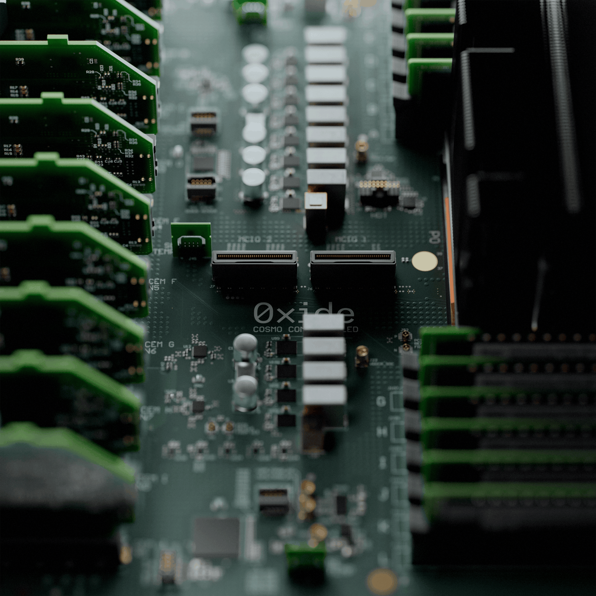
Inital renders felt too conceptual unless you already knew what you were looking at; and the existing rack photographs weren’t ready to use as brand imagery.
The guidelines needed to support practical decisions: what to photograph, how to frame it, which details to emphasise and how to finish the image. Together, these choices would make the rack feel less abstract and extend the Oxide world from just one that read as software, to the reality of Oxide’s full-stack offering.
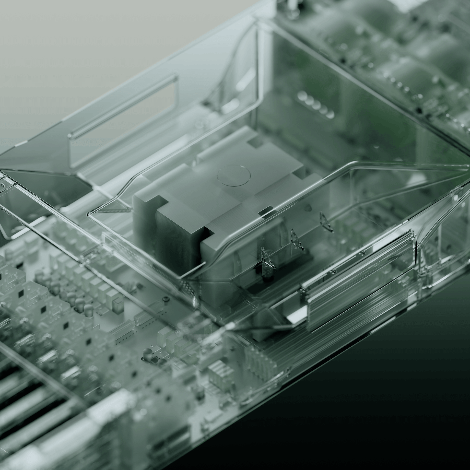
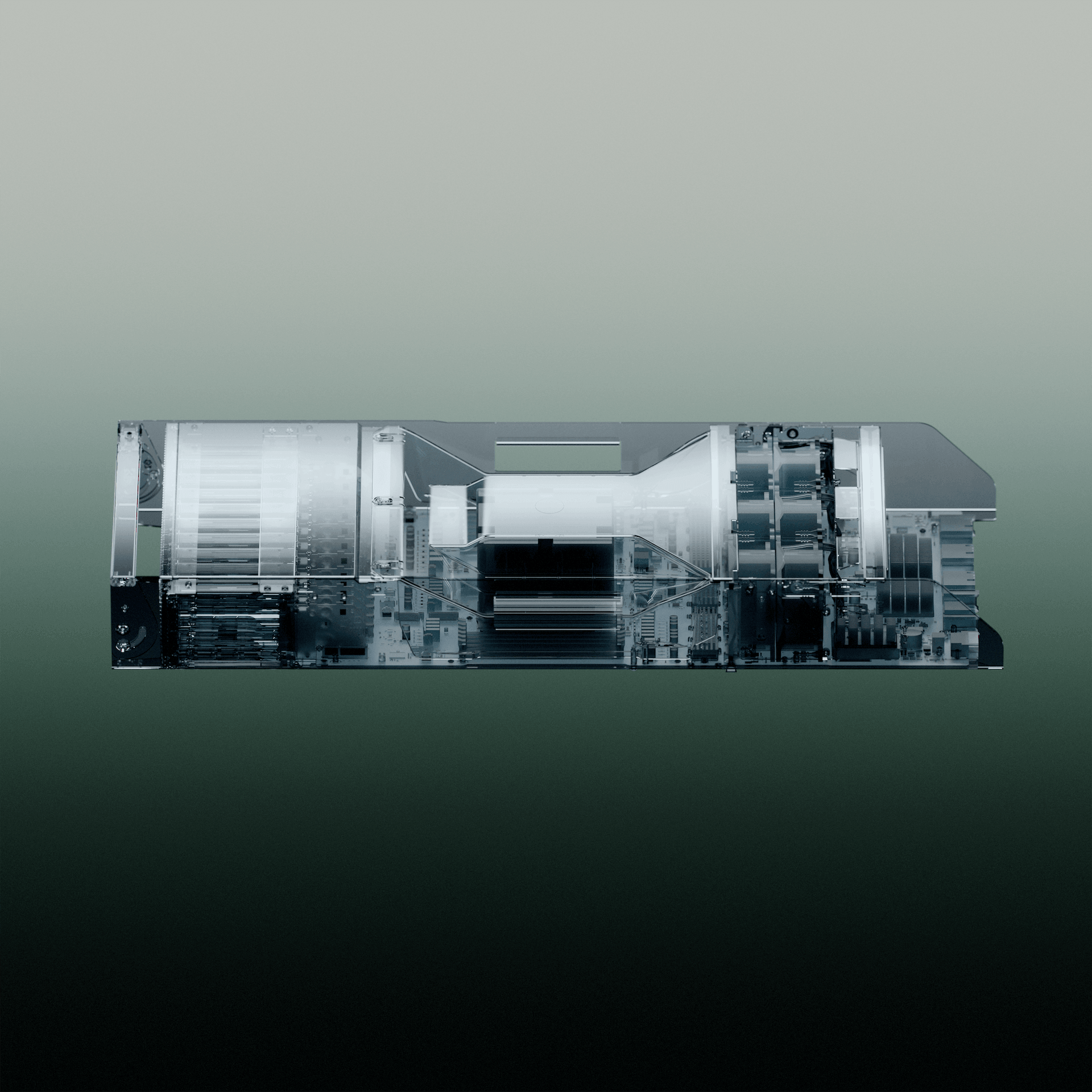
Final outcomes
The team and I were particularly inspired by the colours, textures and ephemera of early computing. That history was already woven into Oxide’s identity, so the interesting part was figuring out how to carry it into the imagery without making everything feel retro for retro’s sake. We looked back for cues, then used them to inspire an approach that felt grounded in what Oxide is building now.
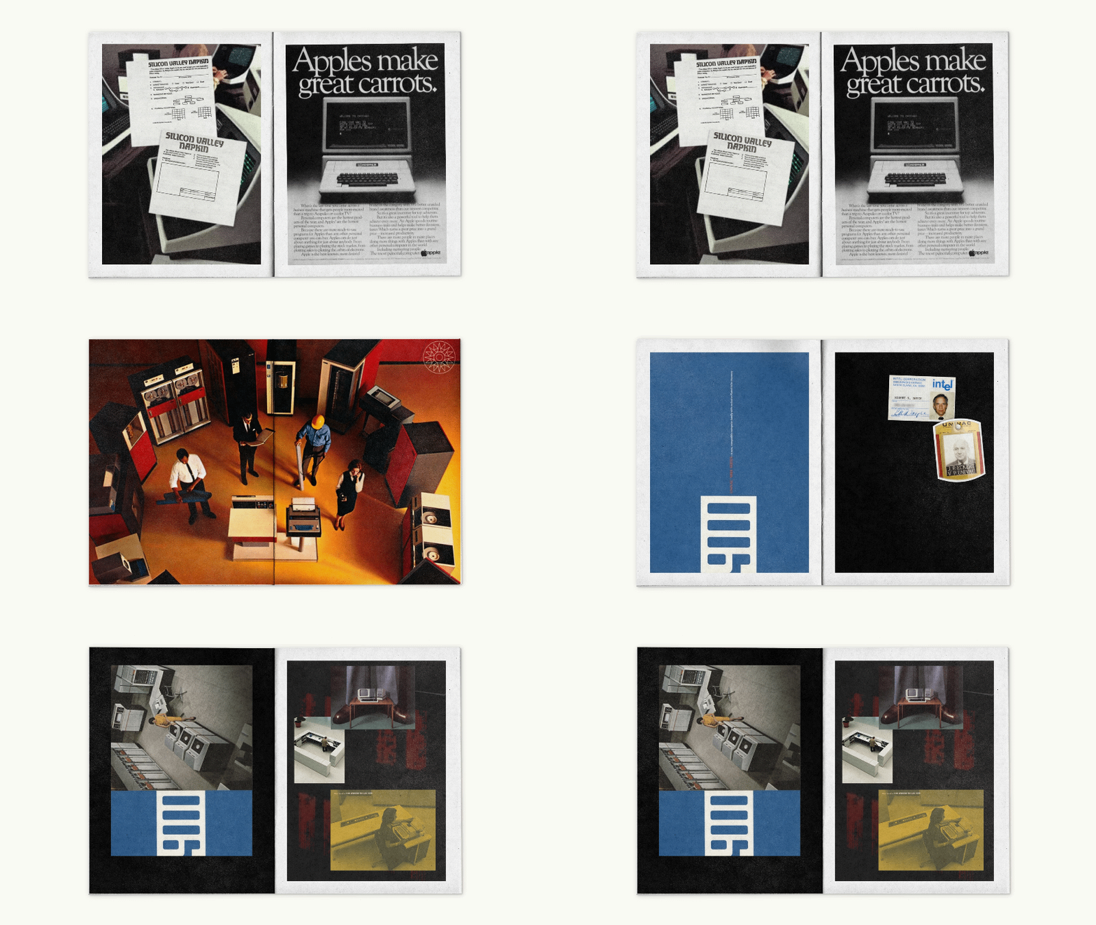
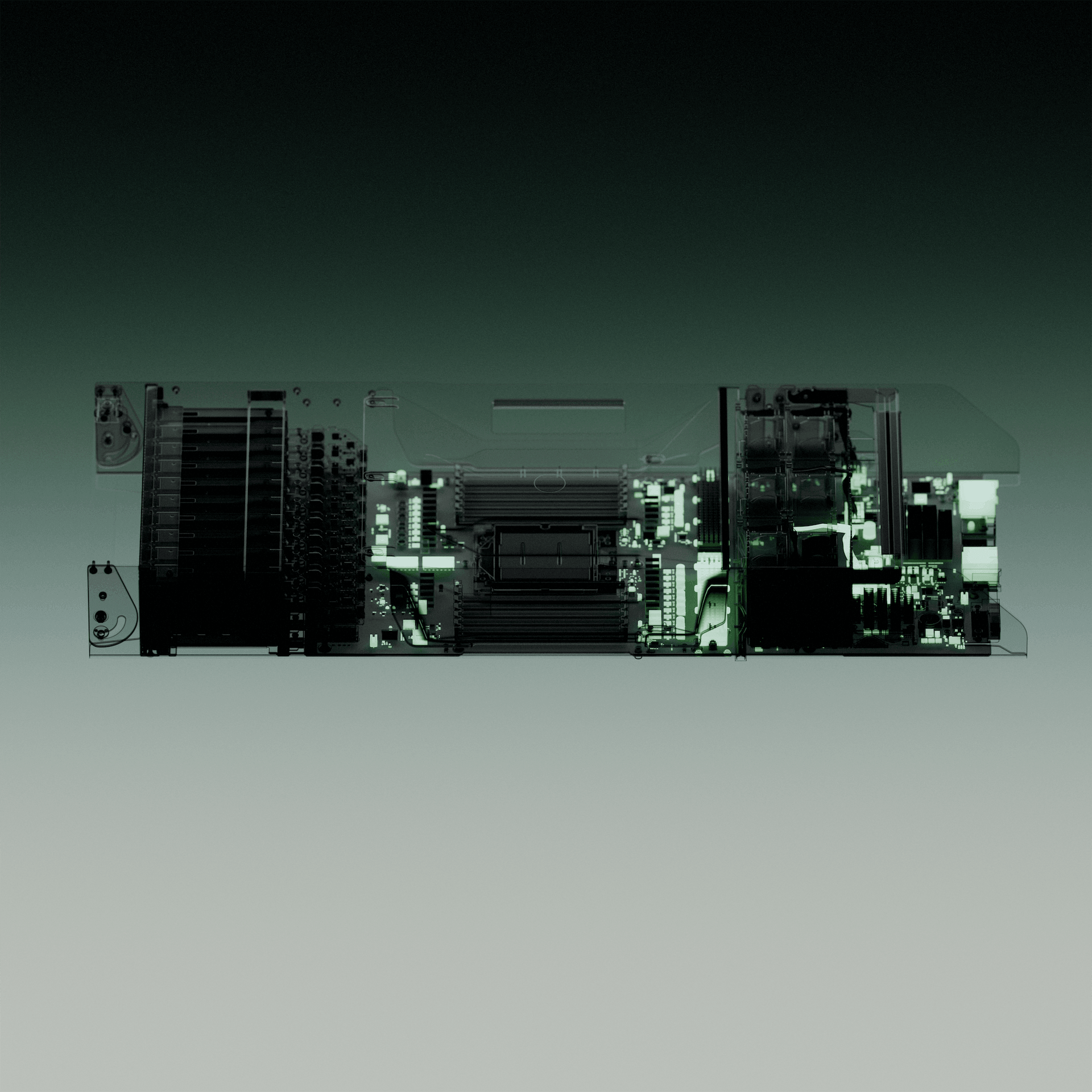
I developed three imagery pillars within Oxide’s brand guidelines: Scale, Precision & Continuity, and Transparency & Anatomy.
These connected the size and intricacy of the systems with the care in their construction, computing’s history, and the idea of making internal structures visible and understandable.
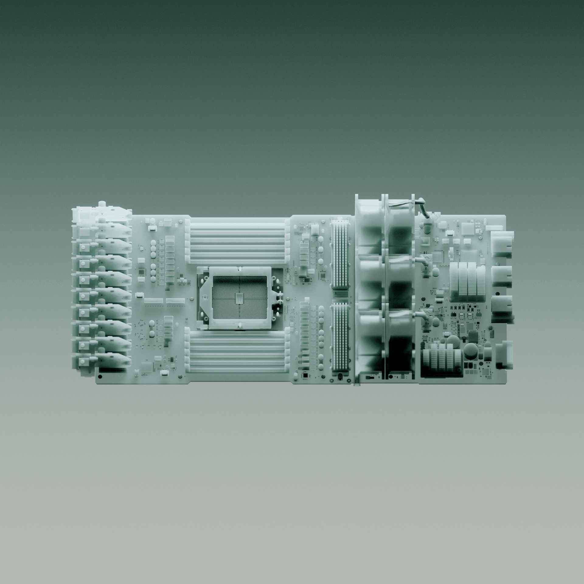
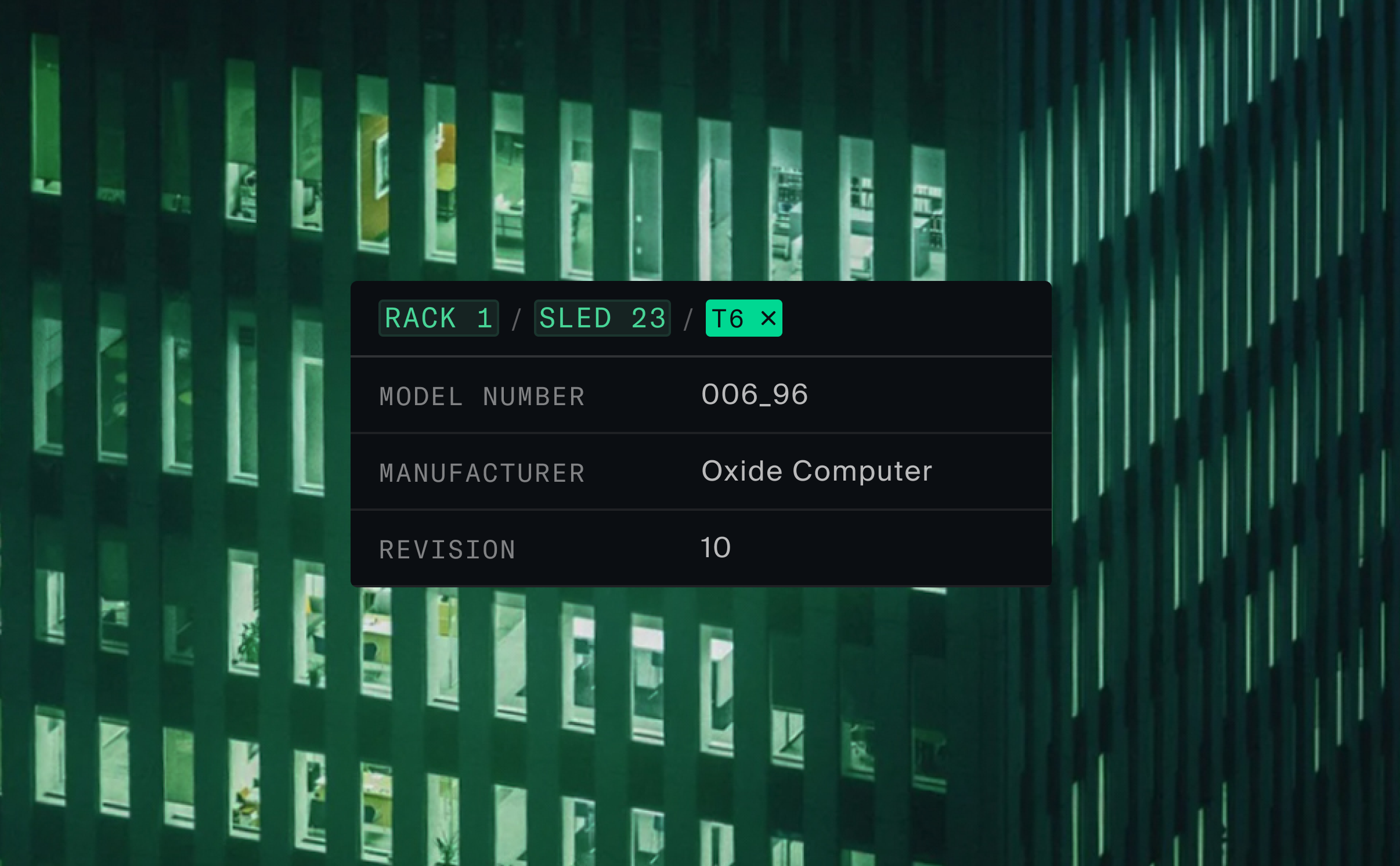
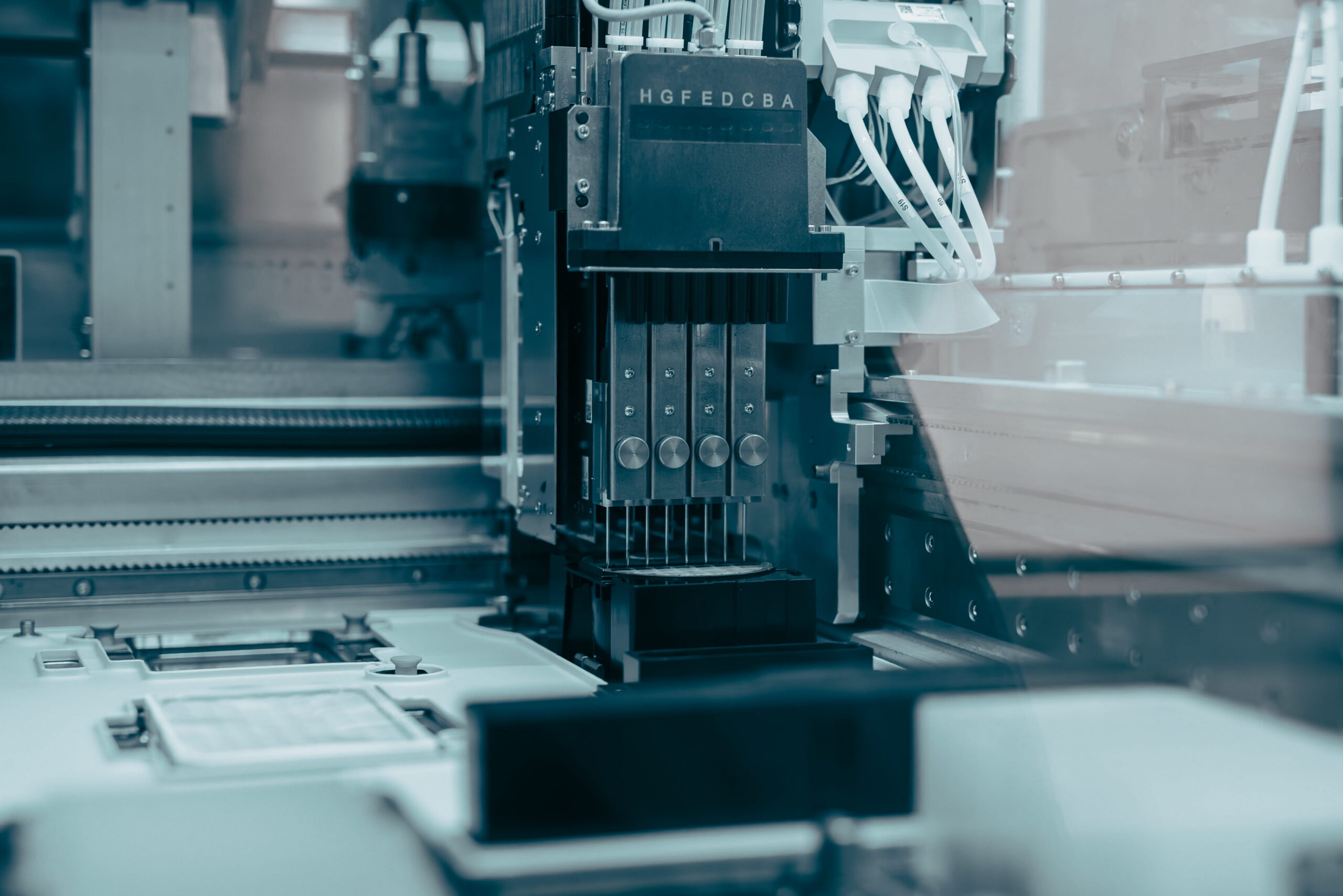
Alongside the pillars, I defined guidance for composition, perspective, colour, texture and lighting. Cool blue-green undertones sat alongside warmer skin tones and natural materials, while gradients and fine grain brought in a subtle nod to early computing. We kept coming back to this texture as the differentiator in tying old and new, connecting the imagery across different applications.
CGI art direction and briefing
I then moved to translate this imagery direction into CGI briefs. Working with 3D artists on product reveals, internal views and supporting motion moments.
The render brief explored how we might bring a tactile, atmospheric visual language to the 3D world. The goal was a unified look but differing approaches across the different scenes. References included schematic and x-ray treatments, retro computing imagery, gradients, noise and liminal lighting.
Development reviews considered lighting, colour, bloom and how convincingly the product occupied a physical space.
Results
Real-world rack imagery
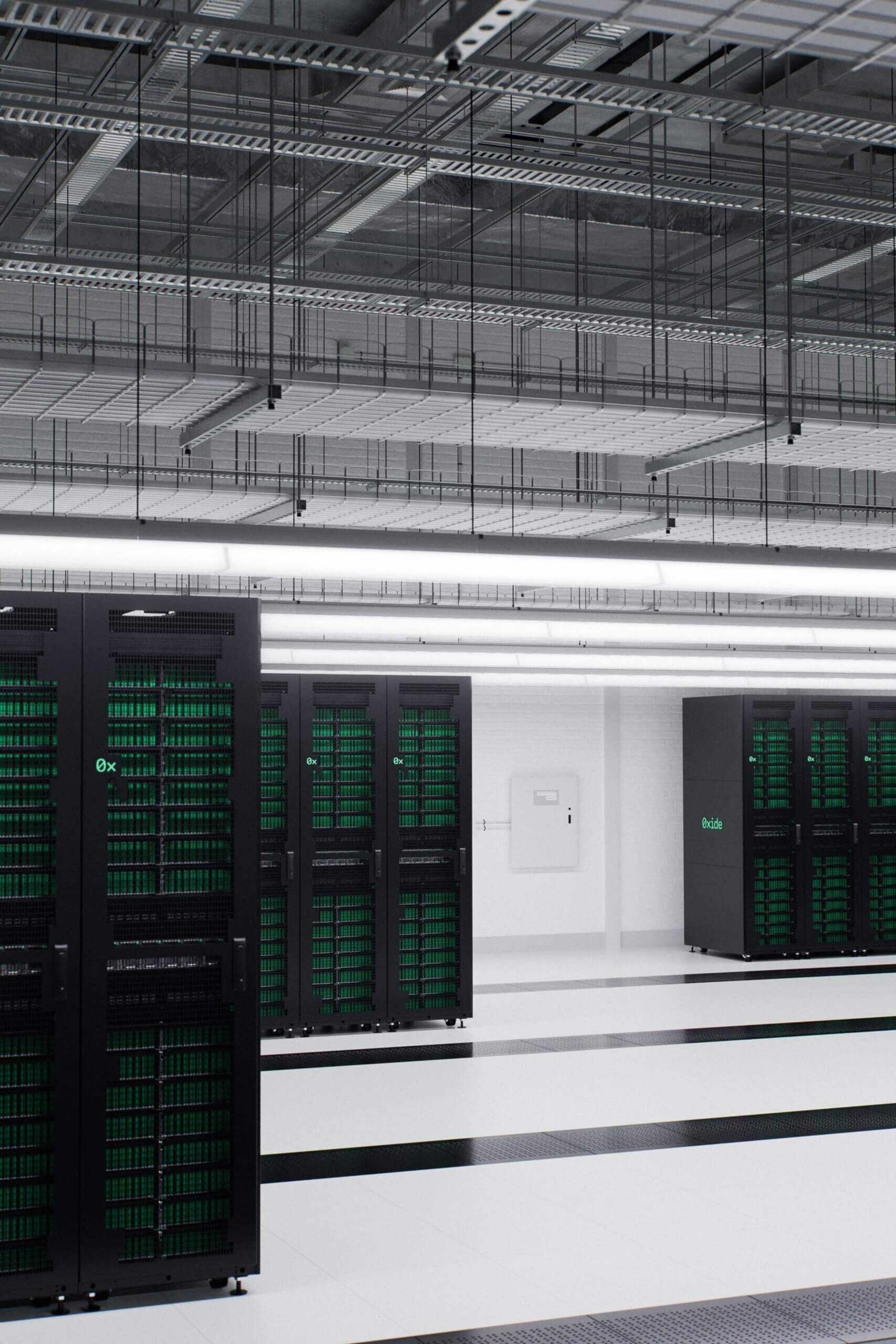
Working with an existing shoot, I composited, retouched, then applied a grade to the rack to create our first art-directed product image.
The original image had an inadequate background, conflicting light and crisscrossing shadows, so I rebuilt the image with layered masks: creating a new background, reshaping the light, and adding shadows and reflections before applying the final grade. The aim was to give the rack a refined presence, without pushing too far, and losing the physical details that makes it real to begin with.
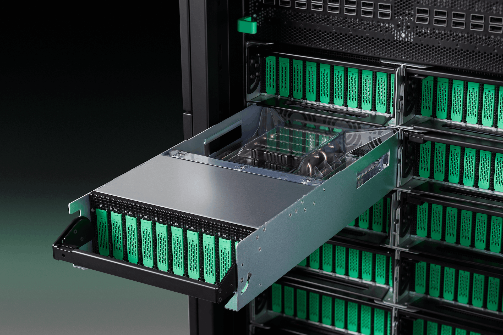
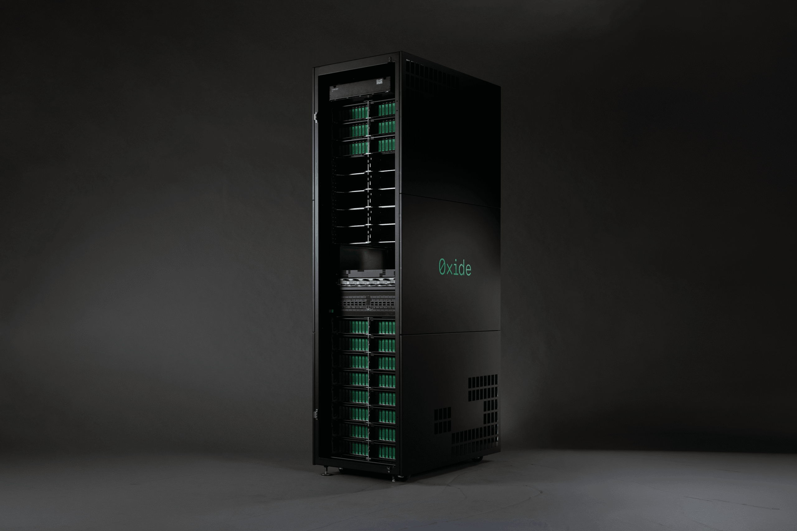
Oxide’s first art-directed photograph of the rack gave the physical on-prem product a grounding in the brand. A LinkedIn post featuring the above image received 10,719 impressions and 284 social engagements.
Alongside it, the imagery guidelines gave photography, CGI and film collaborators a shared direction, turning visual ideas into practical guidance on framing, colour and finish.
Creative development and pre-production
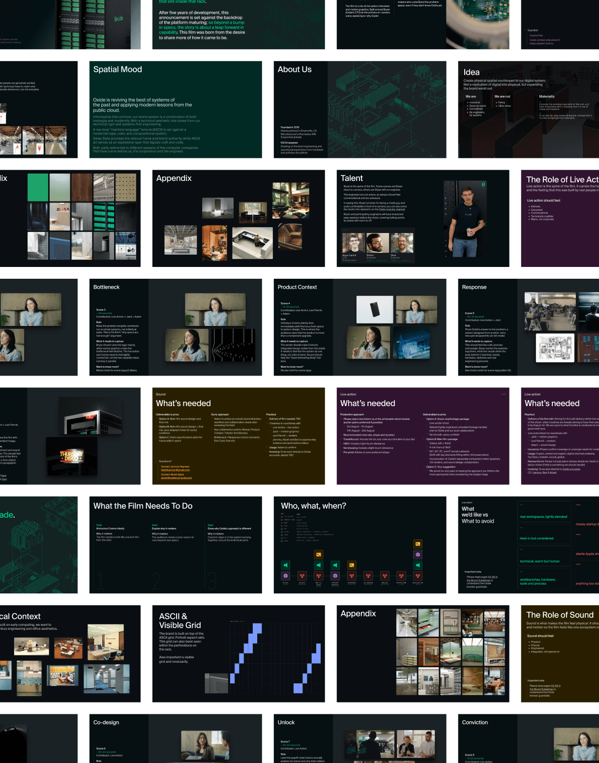
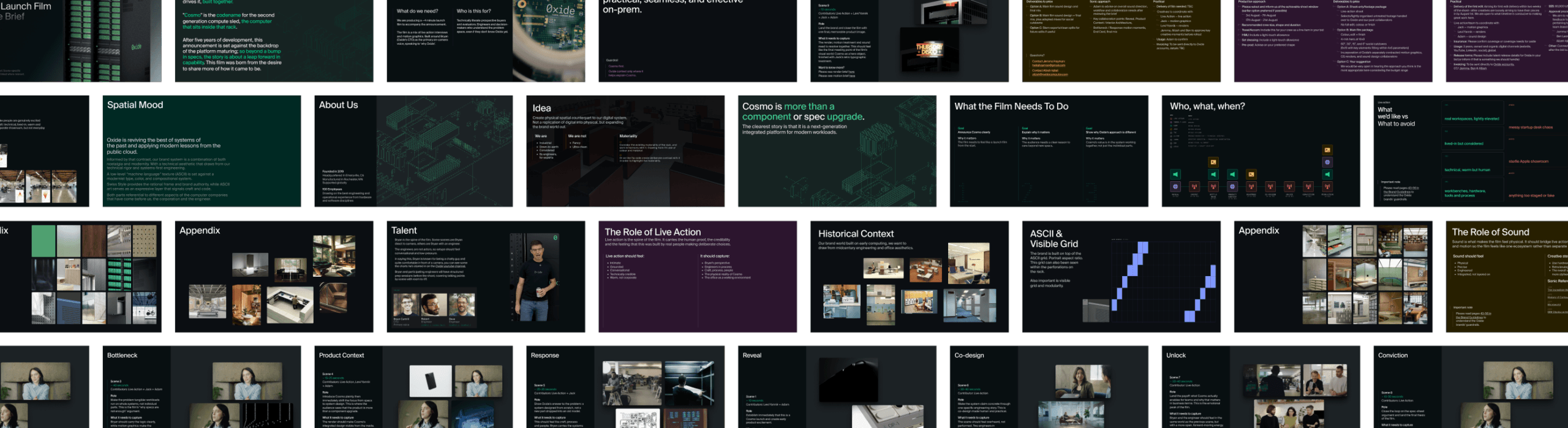
Next I turned my attention to planning hero films and customer stories shoots. I developed references, storyboards, shot lists and briefs with the Oxide team, and helped bring live-action, CGI and motion collaborators into the same conversation. As it stands, the films are in planning, so the work shown here focuses on their creative development and pre-production.
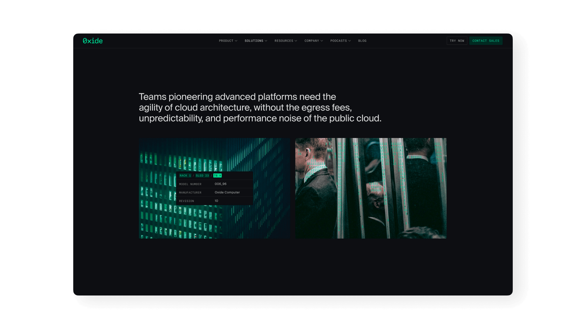
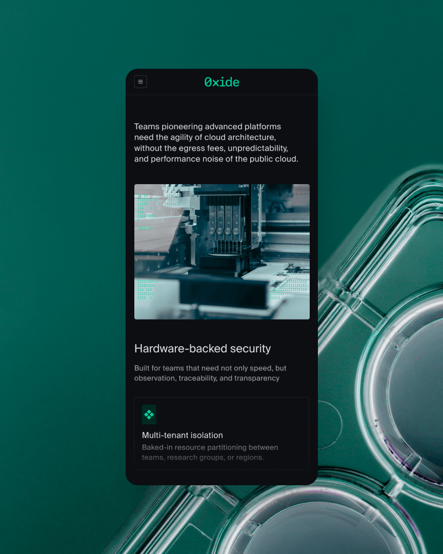
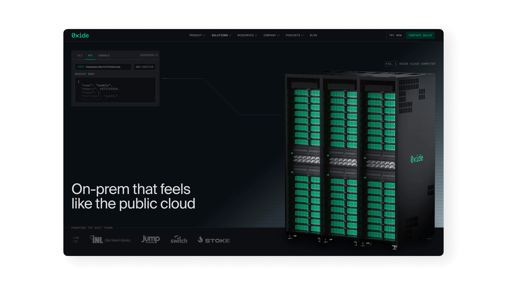
Oxide, in the world
What went well
The strongest connection was between defining the direction and working directly on the images. The pillars gave the work a clear starting point, while retouching and grading provided a way to test how that direction held up in practice.
Challenges and learnings
Creating consistency across Photography and CGI assets meant defining which qualities should carry through, as well as defining where the treatment needed to adapt; sometimes this looked like re-evaluating aspects that had seemed to work previously.
Looking ahead
For the shoots in planning, the opportunity is to continue pressure testing our defined direction in both real environments and further into CGI spaces. I am excited to see how we can push the creative further and to see what we can create.